- Culture
- Digital Marketing Services +
- Mobile +
- Mobile Marketing
- Responsive Design
- Search +
- Adaptive Search Engine Optimization - ASEO
- Display Advertising
- Paid Search Advertising
- Site +
- Content Marketing
- eCommerce
- Landing Page Optimization
- Marketing Analytics
- Marketing Automation
- Social +
- Email Marketing
- Social Community Platform
- Social Media Marketing
- Video Marketing
- WSI Social Selling Mastery Course
- Global Team
- Specialized Supply Chain
- Thinking Differently
- WSI in the Community
Multi-Device Web Design Solutions
Can you remember the last time you visited an ugly website with no ‘relevant’ information? How did it make you feel?
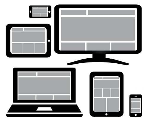
User Experience (UX) Design is an extremely important aspect of digital marketing and therefore web design is no longer a one-size-fits-all proposition. The reason is simple: consumers are viewing your content on desktops, laptops, tablets, smartphones and even TVs? A responsive web design ensures that your potential customers have a memorable experience interacting with your brand while finding the answers to support their next decision.

Make It Easy to Convert Customers Anywhere
Great UX designed for specific devices will increase conversion rates. As businesses and marketers, we need to ensure that our content not only looks good and resonates, but is also appropriate for the device.
When WSI’s founder speaks at Google, he often uses a plumbing example to help illustrate the importance of context, device and time as content delivery cues. If someone is searching for a plumber on their phone at 11:00pm at night, we can assume that they have an emergency and need to speak with a plumber now! Knowing this information allows us to design a context-aware website to quickly address the emergency situation – addressing the visitor’s intent.
“Stop Thinking in Pages. Start Thinking in Systems.”
– Jeremy Keith
Stay Connected